The Appeal of Bright Color Block Spring Dresses
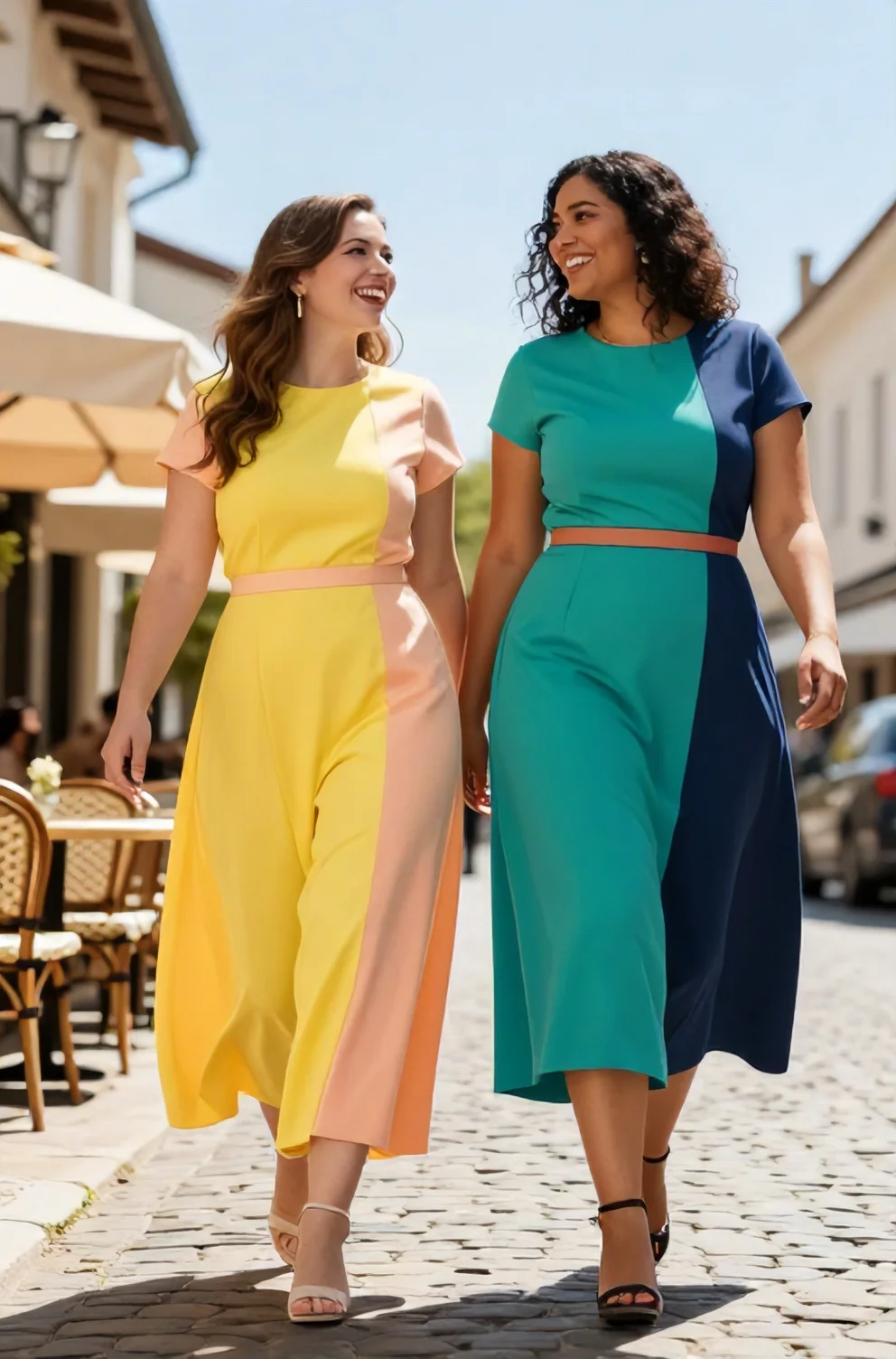
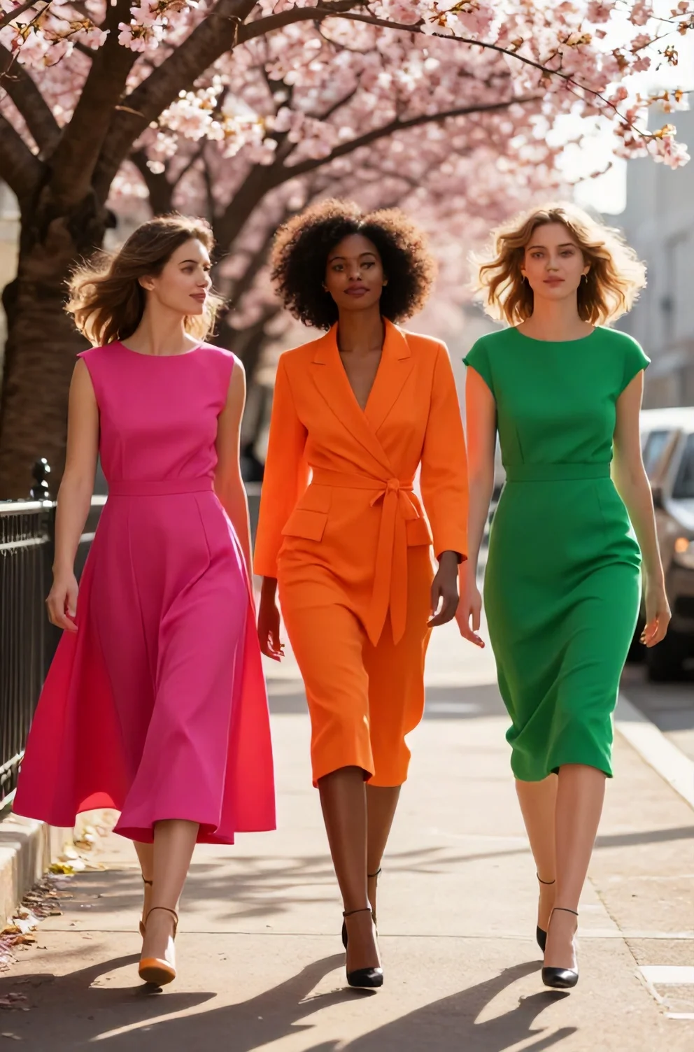
Warm sunny days call for high-contrast palettes that wake up your daily wardrobe. Sharp geometric splits across breathable cottons and linens dominate mood boards every March, offering an architectural alternative to conventional floral patterns. These bold contrast panels bring an intentional, structured look to lightweight midi cuts, giving you an eye-catching piece that works across daytime coffee runs and outdoor brunches. Although saturated paneling looks striking, wearing high-contrast garments comes with distinct challenges. Misjudging panel balance or edge placement easily turns a crisp statement into an awkward clash.
Common Color Pairing Mistakes (and Their Easy Fixes)
Getting the shades right dictates whether large geometric cuts look intentional or haphazard on your body. When two or three saturated panels sit right next to each other, their saturation and temperature react immediately under spring daylight. A balanced combination creates clean boundaries that draw the eye smoothly, giving crisp poplin or soft linen shifts a sharp, grounded presence.
Outfit missteps happen when color values fight for dominance rather than working in tandem. Unchecked tonal friction can swallow subtle design lines and distract from the dress itself, leaving you with an outfit that feels chaotic. Recognizing where these tonal missteps begin allows you to make quick adjustments to tone, saturation, and proportion before you step out the door.
1. Clashing Warm and Cool Undertones
A frequent styling error occurs when a single garment attempts to bridge competing color temperatures, such as placing an icy cobalt or neon mint panel directly against earthy mustard or terracotta. Cool pigments carry a blue base while warm pigments rely on yellow. Juxtaposing electric neon chill beside muted, sun-baked shades forces the eye to process two opposing wavelengths simultaneously, creating a disjointed appearance. The easiest fix is keeping every block within a single temperature family so the overall saturation remains balanced. If you favor sunny warmth, select pieces that group rich coral and golden yellow together. If you prefer crisper notes, commit entirely to jewel tones like sapphire and emerald to keep your spring outfit clean and cohesive.
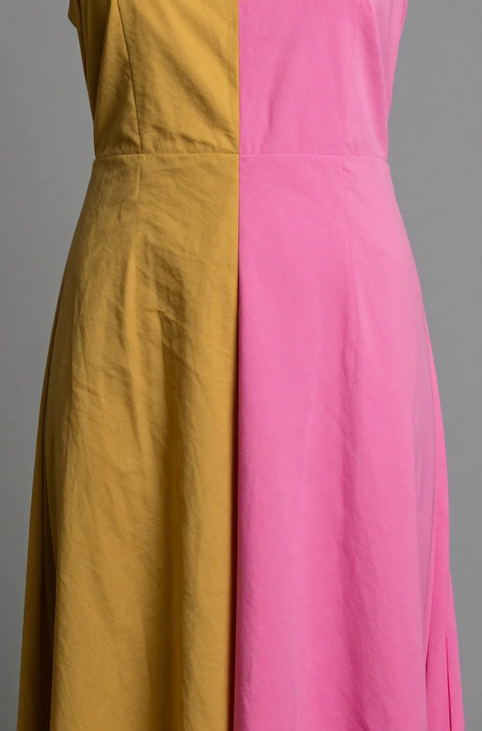
2. Playing It Too Safe with Muddy Colors
Hesitation often leads to softened, dust-tinged pastel shades that sap the energy out of a sharp color block dress. When fabrics carry milky, greyed-out undertones instead of pure pigment, the panels blur together under spring sunlight, creating a washed-out appearance rather than an intentional statement. Color blocking requires visual conviction. The boundaries between separate panels must read clearly from across the room.
- Choose saturated, high-clarity pairings like emerald green alongside royal blue to establish clean division between each block.
- Examine fabrics in natural daylight before wearing them, ensuring the dye looks rich and dense rather than chalky or diluted.
- Balance the intensity across all panels so one saturated block does not overwhelm a muted counterpart.
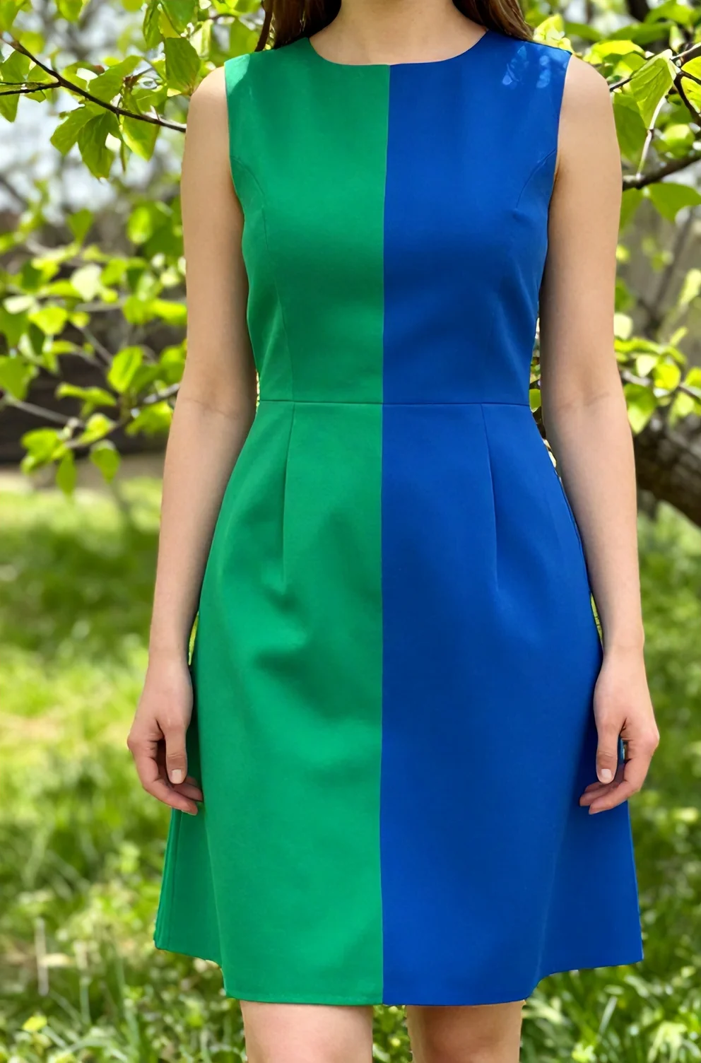
3. Forgetting the 'Rule of Three' in Color Styling
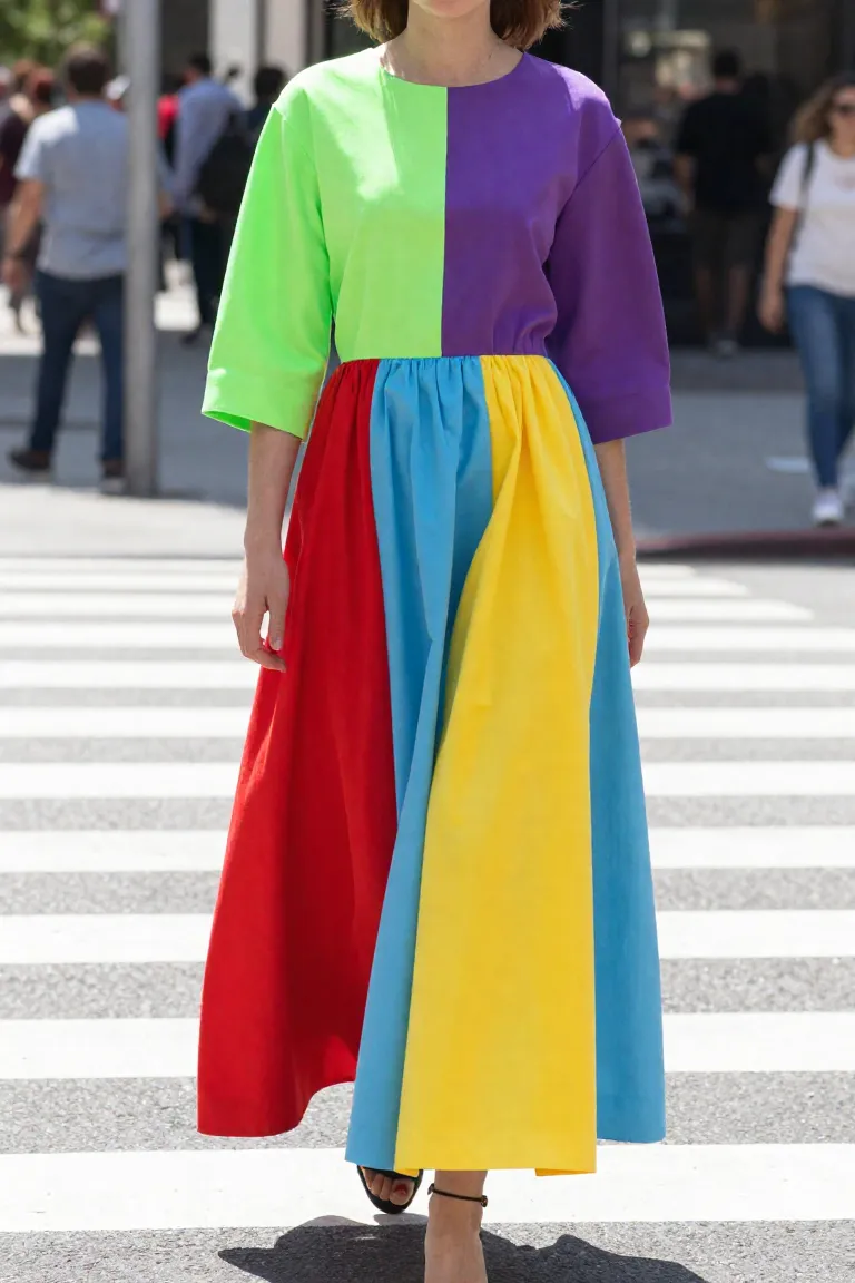
When a single spring dress packs four or five bright shades across its panels, visual chaos takes over. Instead of reading as an intentional design choice, the garment begins to resemble a random patchwork quilt. You can easily fix this by capping your dress palette at a maximum of three strong tones. Choose one dominant foundation shade covering most of the surface, a secondary hue for contrast, and a smaller accent slice to add crisp definition. This three-tone ceiling keeps your look cohesive, giving each color room to register cleanly so the cut and structure of the garment can hold its shape.
Silhouette and Proportion Pitfalls in Color Blocking
Once those tonal balances are set, the exact placement of seams and fabric panels dictates how the eye travels across your frame. Every boundary between contrasting panels acts as a visual guide that reshapes your lines the moment you put the garment on.
- Vertical seam divisions draw the gaze upward and downward, creating an illusion of added length and a narrower center.
- Horizontal cutoffs pull attention outward from side to side, emphasizing width wherever the two tones meet.
- Diagonal panels guide focus across the torso, breaking up wide expanses of fabric and balancing asymmetric movement.
4. Chopping the Body with Awkward Horizontal Blocks
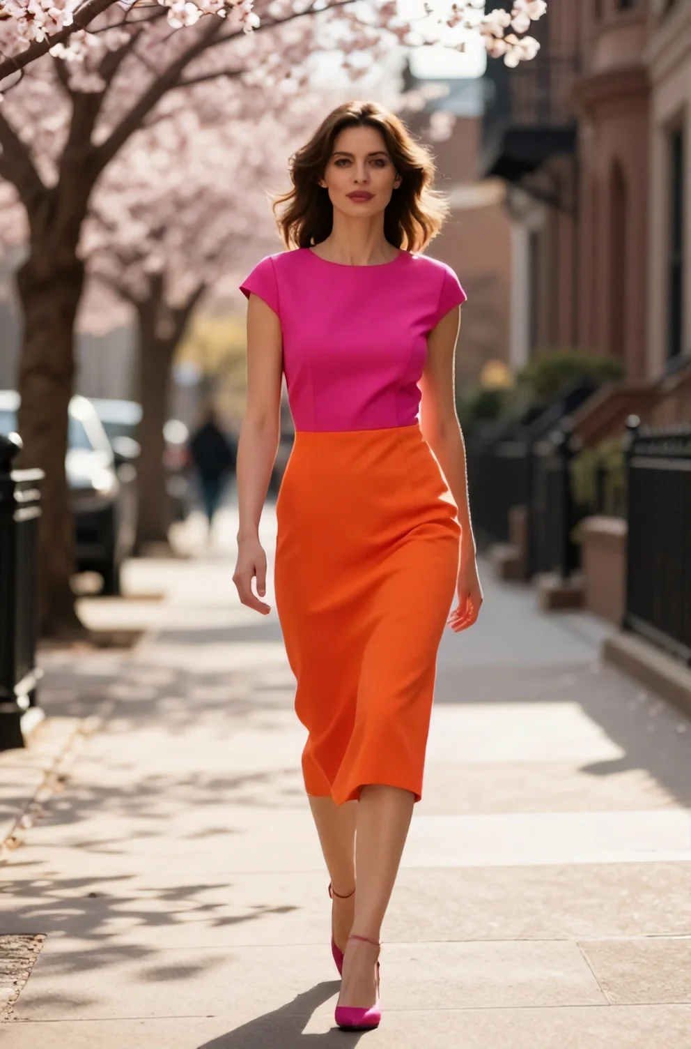
A blunt color seam cutting straight across the widest point of your hips creates a harsh visual break that interrupts vertical eye travel. When a bright pink top block meets an apple green skirt directly across your midsection, the stark division pulls attention outward instead of downward. That division visually halves your height and shortens your natural leg line in bright spring daylight.
Diagonal cut lines or vertical side panels provide a direct solution by guiding focus continuously along your frame. Angular color placement breaks up wide sections of fabric while keeping the eye moving in a continuous line. Pieces cut with an off-center geometric panel or a tonal stripe down the side seam create a clean vertical flow that keeps your spring look balanced.
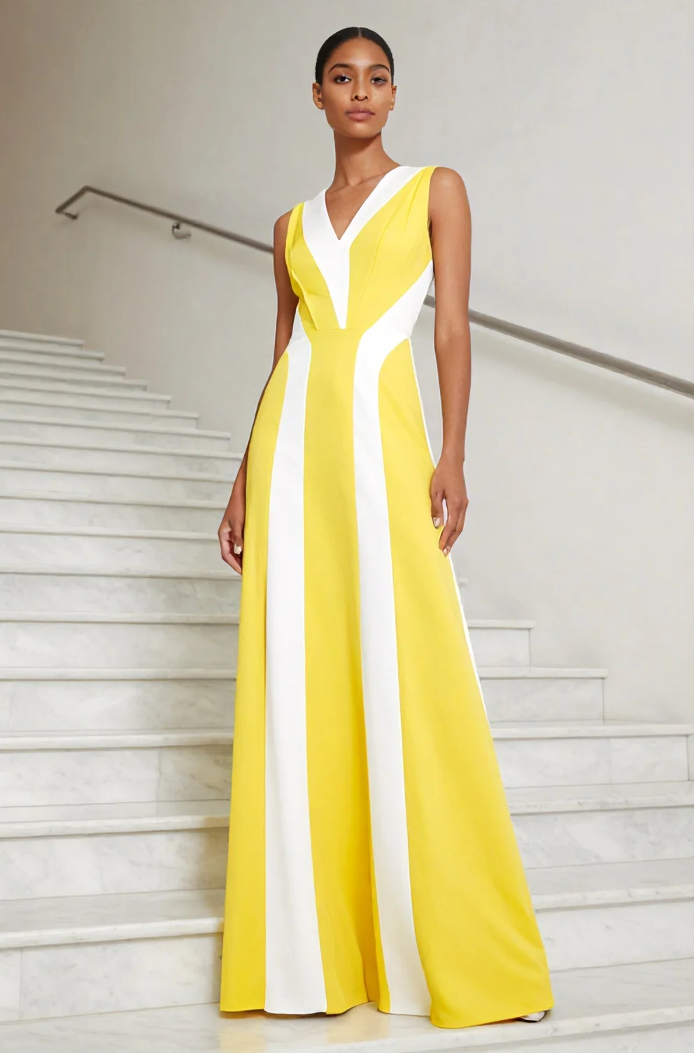
5. Ignoring Your Natural Waistline Placement
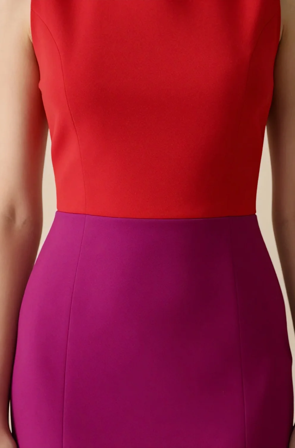
When a horizontal color seam drops just below your ribcage toward the hips, it distorts your upper body and shortens your legs. Many ready-to-wear spring dresses have bright contrasting panels that join around the lower stomach, cutting right across the widest part of the midriff. That misplaced line flattens your curves and creates a boxy shape that works against the natural rise and fall of your frame.
The most effective fix is selecting designs where the darker or more saturated block sits directly at your true waist. A deep navy or rich terracotta band meeting a bright lemon or coral shade at your narrowest curve anchors the entire garment and restores balanced proportions. With the sharpest boundary line resting precisely where you bend, the dress supports your frame naturally and establishes a clean foundation before you add any finishing layers.
Accessory Overload: Where Bright Dresses Go Wrong
Once the cut aligns with your proportions, the sheer presence of multi-toned fabric does almost all the visual work for you. A multi-hue dress commands the room on its own, which means every supplementary piece you pick carries substantial weight. Piling on extra accents quickly clutters your silhouette and scatters the eye instead of letting the bold geometry of your spring outfit shine.
In balanced outfits, your secondary pieces work best in quiet supporting roles. Clean finishes and understated textures let the crisp color splits anchor your presentation and keep the overall effect focused before you address specific pairings.
6. Competing Footwear and Handbag Colors
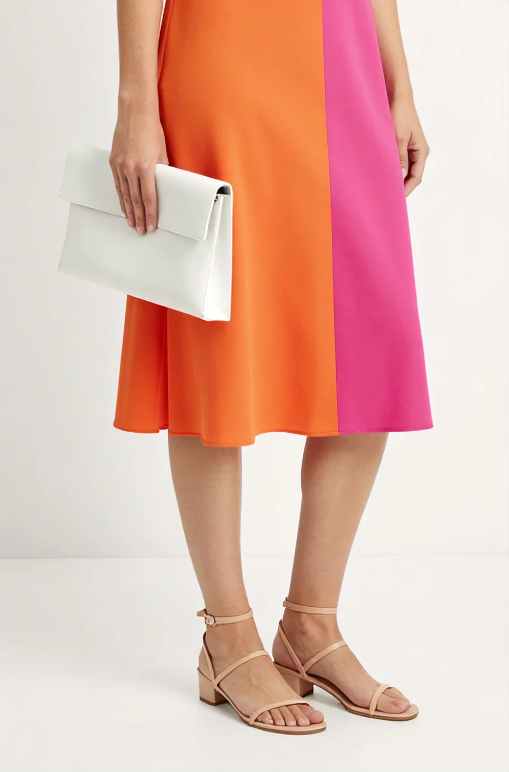
When your dress already combines bright pink and grass green blocks, stepping out in sunny yellow mules or carrying a cobalt clutch creates visual clutter. Each extra saturated shade fights the main panels for attention and scatters the eye across conflicting focal points instead of framing a cohesive spring outfit. That overload blurs the clean graphic lines of the garment and makes the styling feel accidental.
A quiet foundation of crisp neutral tones such as chalk white or soft metallic leather gives the dress space to shine. You can also match your low heels directly to one specific tone already printed on the hem, which binds your base to the fabric while keeping your shoulder bag in an understated cream.
7. Statement Jewelry Clashing with Bold Dress Panels
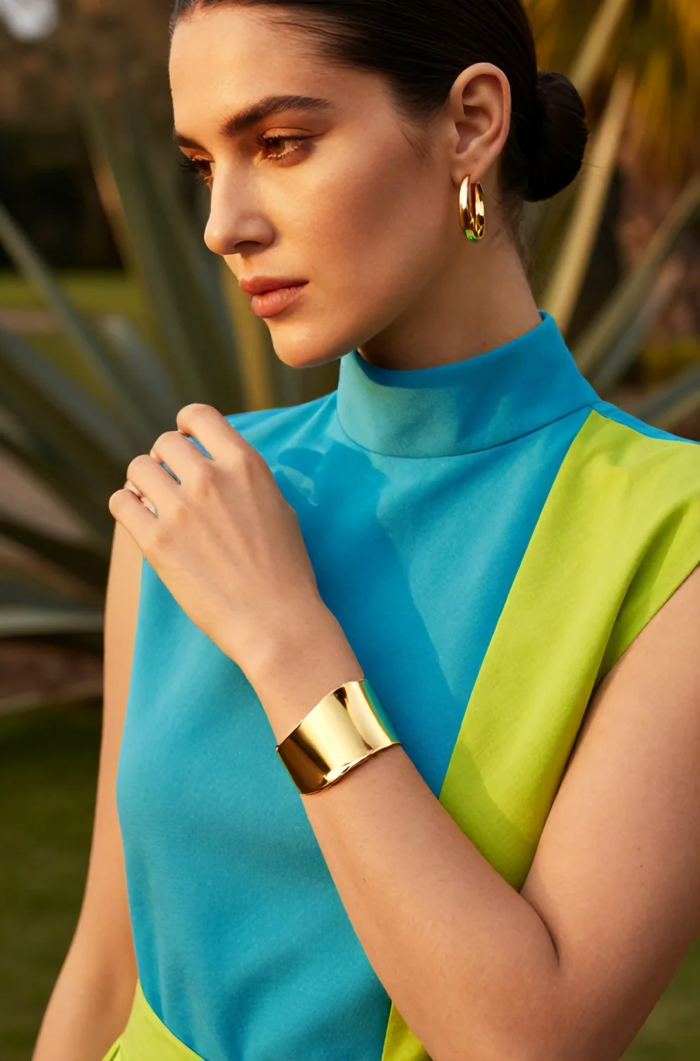
Heavy, multi-colored necklaces compete directly with sharp seam splits, fracturing your neckline and turning contrasts into visual noise. Because color blocking already creates crisp geometric divisions across your torso, stacked beads and ornate collars crowd the fabric rather than letting the pattern breathe. You achieve a far cleaner balance when you swap noisy pieces for simple metal accents that mirror the garment's graphic nature.
- Opt for thin collar chokers or flat snake chains in polished yellow gold or cool silver that rest smoothly above high neckline seams without crossing over color borders.
- Select geometric cuff bracelets or structural wire rings that reinforce the straight edges of your outfit while keeping your chest area uncluttered.
- Wear minimal metal huggies or clean drop earrings to draw attention toward your face instead of pulling focus toward crowded bustline seams.
Frequently Asked Questions About Spring Color Blocking
Contrasting panel dresses suit a petite frame when you focus on vertical color splits and raised waist seams. These cuts guide the gaze upward and lengthen your body line instead of segmenting your torso. When layering with other pieces, skipping florals and competing geometric prints maintains the crisp layout of the main garment. Sticking to solid accessories and tonal outerwear gives each color block breathing room and keeps the focus entirely on the dress's architectural cut.